


Steve Grody's Graffiti Files
Post #4: Some Technical Notes


Above: Zes (“Zeser” here), Silver Lake, 2009. A beautiful, extremely free calligraphic style all his own. Click on image to see it full screen!
As recommended in the previous post, if you are not a veteran graffiti writer, just look at the visual elements of form, rhythm, color and flow of the pieces seen here, and don’t concern yourself with the readability at first. Also, there are a mix of non-permission and permission pieces in this post, and I’m not saying which are which, but since there is no overt vandalism in the true sense of the word, don’t let those issues get in the way of appreciating and enjoying them.
The full scope of modern graffiti has a highly developed technical vocabulary and general skill base. Understanding that visual vocabulary allows us to see the work with deeper understanding. Appreciating much high-end graffiti uses the same sensibilities useful in looking at semi-abstract art (“semi” because the letter base is essentially representational): rhythm, balance, visual dynamics, color scheme. Just as de Kooning and Picasso used the human figure and Richard Diebenkorn the landscape as a springboard for creative visual exploration, so do graffiti writers use letterforms for personal expression. In graffiti, the desire to make the form personally expressive and formally creative may take precedence over legibility. In that way, it may easily be seen as “glyphic modernism,” glyphs being the forms that letters are composed of. And it’s not just developing a distinctive style in general—a number of prominent writers have said that the way they feel on that particular day, happy, angry, sad, is something that should come out in the piece on the wall. A central tenet of 20th century Modernism is that it reflected both the freedom and alienation of the industrial age through fracture, a fine-grained examination of the constituent parts of anything and how something might be reconstituted for artistic expression. Although it is not thought of in those terms in graffiti culture, it is easy to see modern graffiti as a continuation of that ethos.
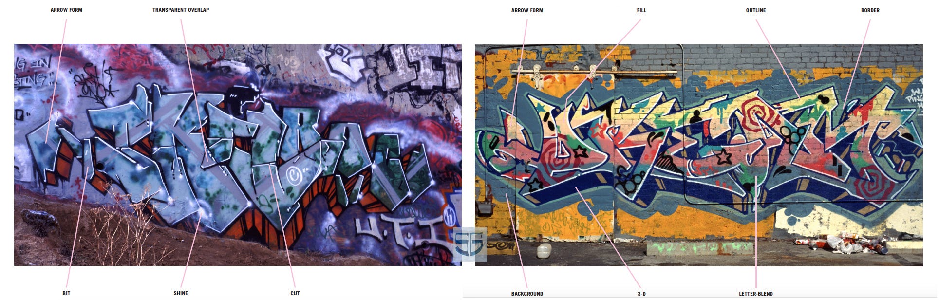
Above: Skill, Motor and National Yard (West L.A.), 1994; Dream, Arts District, 1992 (Illustration from my book Graffiti L.A.: Street Styles and Art, Abrams 2007)
The Skill-Dream diagram shows just a few of the contemporary style writing (what some would call “wildstyle,” the original term that came out of the originating New York movement) visual tropes, devices, that are part of what has become an international visual language base. Some other things to point out in the diagram: Note the smooth color blends in the Dream piece that the other fill forms are on (“fill” being the area inside the letterforms that may be used elaborately or minimally); some of the forms in the fill are “pop,” such as the stars and “hypnosis” spirals, and others look more organic, like lichen growing on rocks (some of the black, green and blue forms in the upper half and in the blue background); the carefully rendered faux paint drips and the drip (partly hidden by the “letter-blend” line) are an homage to the roots of graffiti—paint dripping on a wall; the cuts, breaks in letterforms, and letter-blends (ligature in traditional typography/calligraphy) are all esthetic decisions that relate to the rhythm and flow of the piece.
Along with those shown above, writers may use highlights and drop shadows to render some dimensionality to edges of letterforms (as in the Skill piece) or fill forms; whips—splintered forms that peel off of a main form as an accent or to make a connection with another form, and other techniques and effects that I’ll point out with the images as we go along. As for the terms used, some are common, “fill” for example, but many kids in various locations came up with their own terms, as this variation of graffiti started in the ‘70s before the interweb. Rime, of MSK Crew, has found up to 30 terms for the same thing in his travels around the world.
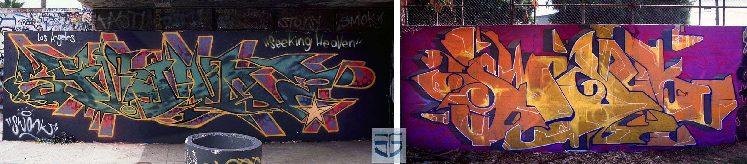
Above: Swank, Venice Pavilion (much missed), 1996, and Belmont Tunnel, 1999. Note the atmospheric fill wending across his Venice piece, and the restrained fill in his Belmont piece with precisely rendered white lines that serve as both emphasis and counterpoint to the letters.
“Flow” is a central term of hip hop, whether talking about DJ-ing, MC-ing, dancing, or graffiti. Flow is the dynamic balance between sameness and difference that keeps our sensory and mental interest. Phrasing has the same meaning in jazz, narrative arc has an equivalent meaning in literature, and dynamic composition in traditional painting.
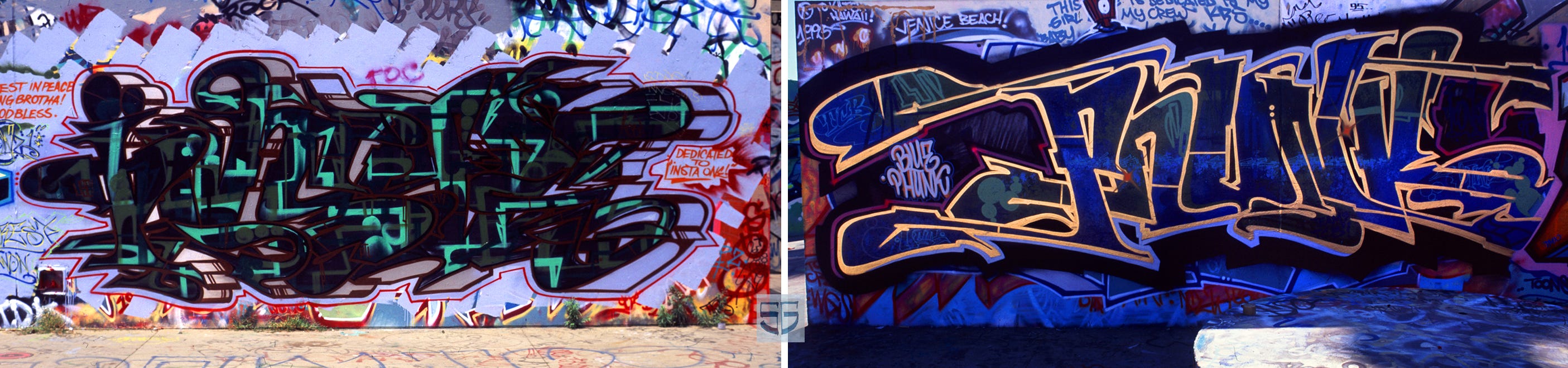
Above: Toons, both at the Venice Pavilion, 1995. “Insta” on the left, dedicated to a writer murdered by a vigilante, and “Phunk” on the right. He has fine color schemes, and in both cases works with tremendous precision but with a result that has great movement that looks very spontaneous. I may have to rescan the slide at higher res to post a detail photo of the amazing control of his fill forms.
It’s interesting to note that all creative expressions of hip hop—graffiti, its dance forms, scratching, MC-ing—as well as youth originated sports such as skateboarding and BMX bike sports, all now established commercial enterprises, come from the inspiration of creating something expressive and extraordinary with a paucity of resources: just your body in dance, a turntable and a microphone for scratching and DJ-ing, and spray paint in graffiti. A relevant if not commonly used term in all of this, is Rasquache, a Mexican term referring to something considered low-class, throwaway, or beneath respect. Rasquachismo is the ethos of creating something expressive out of those materials or practices considered to be rasquache. All of the above-mentioned hip hop and youth-originated sports are rasquache-inspired practices in spirit even if evolved from a truly multi-cultural mix of kids.

Above: Unit, both at Motor Yard, 1992. One more angular, and the other more curvilinear, but both are great examples of having fill forms that both conform to the letter edge, and spill across in an independent counterpoint (particularly in the piece on the right, great color scheme), with the warm grey angular forms providing a secondary counterpoint to the yellow forms; the piece on the left also shows several levels of visual counterpoint within the fill and relative to the letter shapes. Unit also has shapes outside of he piece that echo the fill forms.

Above: Charlie, Belmont Tunnel, 1991, and 1992. “Ochoa” on the left and “Pocha” on the right: he used a number of names and words just to change things up. Charlie is considered to be an important foundational writer in L.A.

Above: Use, 2015 and 2016, same fence north of Chinatown. Both are memorial pieces to crewmate Ayer. In showing two examples of a writer’s work, we can see features of their style and how they work to vary it as well.
And for paid subscribers (“less than the cost of a fancy coffee or beer for a month of posts!”): A few more by Unit, Besk and Dreye!
All images copyright Steve Grody.
Keep reading with a 7-day free trial
Subscribe to Steve Grody's Graffiti Files to keep reading this post and get 7 days of free access to the full post archives.